
A Window into Climate Change
The Batagaika Crater, located near the town Batagai in the Siberian Republic of Sakha, Russia, is the world’s largest permafrost crater, sometimes called a « megaslump. » It formed due to the melting of permafrost — a layer of permanently frozen ground — after deforestation and rising temperatures caused the ground to collapse. The crater is approximately 1 kilometer long, 800 meters wide, and up to 100 meters deep. It continues to expand by up to 10 meters per year, making it a striking example of how climate change is reshaping landscapes.
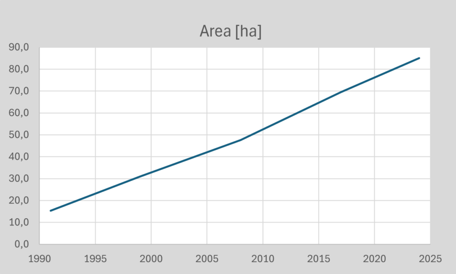
Development of the crater area as derived from satellite data.
Permafrost is crucial for maintaining stable ground in Arctic and sub-Arctic regions. When it melts, the ground weakens and sinks, releasing stored greenhouse gases like carbon dioxide and methane. An estimated amount of 1,500 billion tons of carbon is stored in permafrost—twice the amount currently in the atmosphere. In Siberia, average temperatures have increased by about 2–4°C over the past 50 years, accelerating permafrost thaw. As the Batagaika Crater expands, it could release significant amounts of carbon, further contributing to global warming in a dangerous feedback loop.
The growth of the crater poses risks to local communities. The unstable ground threatens infrastructure, making roads and buildings unsafe. Additionally, the release of greenhouse gases can worsen climate conditions, affecting weather patterns and ecosystems. Indigenous populations that rely on permafrost-stable landscapes for traditional livelihoods, such as herding and hunting, may face severe disruptions.
The sequence of satellite image maps shows the growing extent of the crater during the past 35 years. In addition to that, the improvement of quality of satellite data can be followed, with respect to both spatial and spectral information content.
Satellite technology plays an important role in monitoring the Batagaika Crater and other remote permafrost regions. High-resolution satellite images track changes in the crater’s size, while temperature data help understand melting patterns. This information is vital for developing strategies to mitigate these climate change impacts and adapt to shifting environmental conditions.
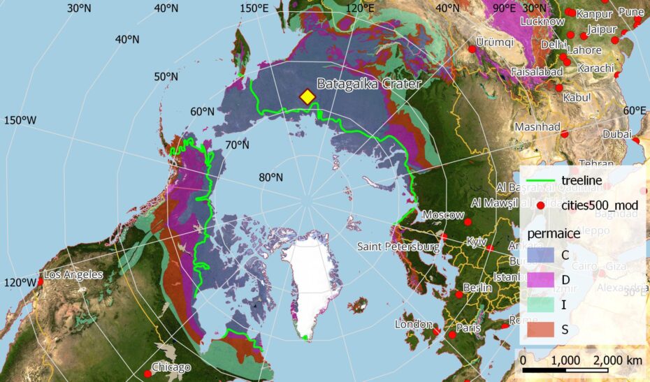
Distribution of permafrost in the northern hemisphere (permafrost zones: C continuous, D discontinuous, I isolated patches, S sporadic). The treeline indicates the northern border of trees. (Sources: permafrost data: NSCIDC, satellite image background: NASA Blue Marble).
Exercises
- Satellite Map:
- Look at the satellite image map and zoom to the region of the Batagaika Crater southeast of the town Batagai (the crater area is highlighted by the coloured layer « crater extent »). Use the layer selector to deselect the layer « crater extent« .
- Use the layer selector to add/remove the true colour satellite images one by one and compare. Which different features and landcover types can you identify? Think about vegetated areas, bare land and water bodies. How can you discern them? Which differences can you identify with respect to the quality of the satellite data?
- Use the measure tool to assess the crater area in the different years and draw a diagram showing the development of the area. Compare your findings with the data provided in the diagram above.
- Which factors can you imagine that contribute to an increased erosion of permafrost soil? Think e.g. about the stabilizing role of vegetation, temperature changes, absorption of solar radiation by different land cover types, etc.
- Think about the material eroded from the crater (so far about 0.1 km³). Where has it gone? What influences could it have there? Think about the role of sediments as nutrients for algae.
- Copernicus Browser:
- Open the Copernicus Browser.
- Find the most recent Sentinel-2 dataset covering the area displayed in the satellite map. Is it easy to find (more or less) cloud-free images? Why/why not?
- Select a true colour visualisation.
- Can you identify additional, recent changes in the area (check e.g. for a recovery of the vegetation)?
- Search for Sentinel-2 datasets from July 2019, when wildfires affected large areas in the region. Try to find an image showing the fires. Use the « false color (urban) » visualisation to highlight the fire fronts. How are burnt areas, vegetation, and fires displayed in this visualisation? Zoom out to get an impression of the scale of the fires.
Sources and Links
| Downloads: | |
| PDF document of the case study (includes exercises): English, German, French, Italian, Spanish |
| Links: |
|