
True Colour and Infrared Images
From Data to Images
Most Earth observation satellites do not deliver standard colour images. They rather acquire series of greyscale images in different parts of the electromagnetic spectrum. These image bands are used for scientific evaluations, and, similar to the procedures applied in printing and display technology, they are combined to produce colour images of various types for a wealth of different visualisation purposes.
Different from usual photography, the greyscale image bands are combined in various ways. Depending on the application, images are produced in natural colours (true-colour image), false-colour infrared images and other band combinations.
True colours and False-colour infrared Images
While true colour images are used to show the Earth “as it is” (i.e. as it would appear to the human eye) for mapping and illustration purposes, other representations are used to highlight specific properties of the displayed area.
Important additional information is contained especially in the infrared image bands. This information is used e.g. to highlight and to analyse properties of plants, because the chlorophyll contained in the leaves reflects the infrared part of the sunlight very well. This makes this data a valuable information source for applications in agriculture and nature protection.
Other uses for false-colour infrared representations using other infrared bands include analyses of fires and volcanic activities, and of properties of urban spaces.
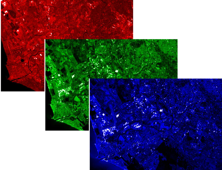
Illustration of the combination of individual image bands to an RGB colour representation.
Exercises
- Satellite Map:
- Use the layer selector to look at the true-colour and false colour infrared visualisations of the Sentinel-2 data. Describe similarities and differences.
- Focus on the forest area in the lower centre of the images. Which visualisation provides the clearest view of different forest types? Think about the differences in the colour of young leaves and the needles of a fir.
- Look at the water bodies (sea, river). How do they appear in the individual image bands?
- For advanced readers: focus on the built-up areas in the upper right corners, which are the southwestern parts of Rome. Which of the visualisations is the best to separate built-up areas from other land cover classes such as cropland?
- Copernicus Browser:
- Open the case study area in the Copernicus Browser.
- Find the most recent Sentinel-2 dataset covering the area displayed in the satellite map.
- Select a natural colour representation.
- Can you identify additional, recent changes in the area?
- For advanced readers: Select other false colour representations offered by the Copernicus Browser, such as the False Colour Infrared (Urban) representation and the Short Wave Infrared (SWIR) representation. Which land-use classes can be discriminated in which representation?
Links and Sources
| Downloads: | |
|
PDF document of the case study (includes exercises): English, German, French, Italian, Spanish |
|
|
|
This case study is covered on page 18 of the printed ESA Schoolatlas – download the PDF document of the page: English, German, French, Italian, Spanish |
| Links: |
|